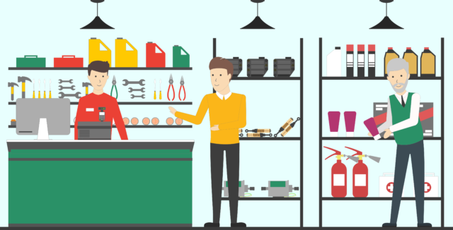
As store design expert Paul Reed points out, great store design involves a lot more than just good lighting and attractive display spaces. It’s about the human environment and how people, both customers and staff, function within it.
By Paul Reed
The Showroom Guy
I’ve had quite a few customers over the last 10 years tell me I’m the first guy that walked in that understands what their needs are. That’s because I have a 30-year automotive background; I worked in it. I’ve done fixed operations, service management, sales management, been a fleet manager, worked in the parts and service area. So I understand why it’s got to be done a certain way. It’s nice to have a pretty store, but it’s also got to be efficient and functional.

The Showroom Guy info@theshowroomguy.com
Effective store design takes into account the impact on your staff and how efficiently and effectively they can do their jobs. Sometimes this is about correcting major design issues, sometimes it’s simple.
I remember looking at a store in Southern Ontario near Cornwall that a group had bought, and asked me to go in and redesign for the group. I had a wonderful chat with the staff member behind the counter.
She had been there for 14 years and she had this little cubby box beside her full of paperwork. I asked her, what do you use that for? She laughed and said, oh, I don’t know, it’s been there since I was here. I said, really, for 14 years? I’m not knocking any of my clients, it’s just that they need a new breath of fresh air in some of their locations.
I understand that it’s hard to get staff to change. But once you show them the beauty of efficiency, cleaner counters, laminate that’s not peeling off at their fingertips, they’re not getting their sweaters caught, they might change their minds. And often it’s not about big obvious changes, either: We might suggest a locktop, a drawer where you can put your wallet or purse or phones and lock it up. Then they go, I like that idea because my stuff is just over there out in the open.
It makes sense to design your environment not just to be efficient for your customer but for your staff. Here’s another example: anybody who’s been in and around stores for a long time, knows that quite commonly there’s that really long walk down to the end of the counter to get out to the showroom.
There’s that flip-up door at the end of the counter and then out into the showroom, just to serve a customer for a few seconds – then all the way back, flipping that part of the counter down again, back into the penalty box.
When a staff member comes out from behind the counter to help someone, let’s say it takes them 30 seconds to get around to meet them. And that 30 seconds multiplied by 50 times a day by four different staff members, say five days a week, four days for four weeks a month…it adds up quick. And some people say that’s only 30 seconds. But 30 seconds is a lot of time, just to get out to help a customer.
Another client two years ago in Levi, Quebec, wanted to build a mezzanine and put his staff lunchroom up there. And I said, well, why wouldn’t you put it underneath the mezzanine? He said no, I want them up there. I said, well, then you’re looking at safety factors. You have a technician that’s always in a rush. If he rushes up these steel stairs and trips and hurts himself, he’s gone for the day. So now your customers are backlogged.
I said, if it’s on the main floor and he just opens it and walks in, there’s less likelihood of him hurting himself. Plus there’s the distance he has to travel. It was probably 40 feet further. If he leaves his phone in the lunchroom, he has to go back again. So the client decided to finally put it down below, because I explained the efficiency and the lower risk of hazards or of someone getting hurt.
So when we design a store, we look at everything like that: how easy it is for the staff member to greet the customer, how easy it is for the customer to visually see you as they walk in the store, that there’s a staff member available if the customer needs something right away, or they can just wander in and have open space, and how easy it is for the staff member to utilize the space to do his job.
For several years now, I’ve been pushing digital.
Digital makes it just more efficient, and often more profitable for you. Canadian Tire is very good at this: they have touchscreens in the aisles, where you can look up things on a tablet rather than searching down someone to help you; you can put your info in and it brings up the product and tells you which aisle has those products.
That’s more efficient for you, and it allows your staff to be doing other things, because now that client can help themselves. And when he comes to your counter, your service people can still say, did you find everything you needed? And if he didn’t, he could ask at that point, or you can recommend things.
It is probably a fair generalization to say that that when people think of the elements of service shop design, they think first of the customer. And while the customer, and how they move through the retail portion of an operation is very important, it’s not the whole story. There’s all these other small things you might not consider – but they make a surprising difference not only to designing a store that’s pleasant and efficient to be in, but directly to your bottom line.


0 Comments